Summary
TransCanWork is a nonprofit working to eliminate barriers to employment for gender diverse individuals. They looked to us to create a portal that would streamline the job-hunting process for both their clientele and their internal employees.
Role
Design Engineer
Contributions
UX Research · Illustration · Design System · Frontend Development
Toolkit
Figma · FigJam · React · Notion
Team
2 Product Managers · 3 Designers · 10 Developers
Timeline
10 Months (Nov 2022 – Sep 2023)
Problem Statement
"With us navigators working with over 100 job seekers at a time, we struggle to meet the needs of the position, and things fall through the cracks."
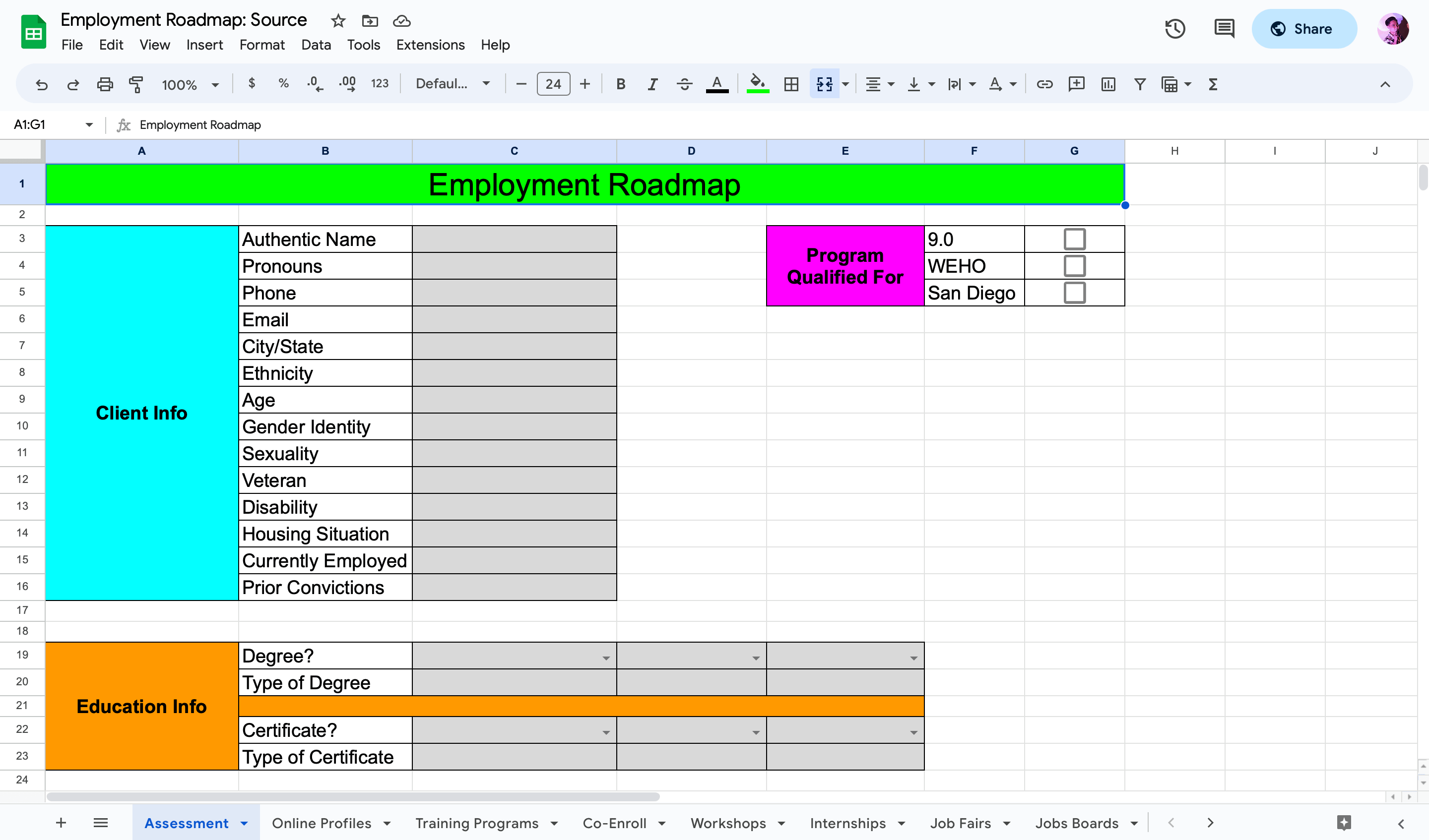
To run their career services program, TransCanWork (TCW) kept track of each client's job hunting progress through a cumbersome, multi-page Google Sheets document.
For navigators (TCW's in-house career mentors), repeating this workflow for many different clients was tedious and susceptible to human error. On the client side, the process was not very interactive or transparent. Jobseekers had no way to even see their own progress outside of scheduled calls with their navigator, contributing to higher churn rates!
Competitive Analysis
Seeing how we can fill in gaps in the market.
To kick off our research, we conducted an analysis of three websites which offer services similar to that of TCW’s: JibberJobber, Youth@Work, and Job Search Journey. We were then able to identify commonalities between the sites which suggested features we should incorporate in our own product, as well as things we noticed that we'd want to avoid doing.
Contextual Inquiry
"It would be a quicker process if clients could see their file without having to wait for the next availability to book a whole meeting with me."
Next, my team and I interviewed several TransCanWork employees to better understand the issues they were facing. Our conversations confirmed from firsthand sources that TCW’s process took a great deal of agency out of jobseekers' hands, while simultaneously forcing lots of manual work and organization onto navigators.

Jobseekers felt removed from their own job-searching process.
During our inquiries with TCW navigators, we found out that jobseekers only get to meet with their navigators once every 2 weeks, at most. Between sessions, jobseekers had no way of accessing the information on their own progress that navigators were seeing. To make matters worse, they lacked easy communication with their navigators, leading to an uninteractive and isolating experience.
TCW’s systems were unequipped to handle large numbers of clients.
While TCW’s spreadsheets were the very backbone of their work, they also contributed to a slow, tedious workflow since each jobseeker had their own individual spreadsheet. Our research revealed that navigators could expect to have upwards of 100 clients at a time. Having no compartmentalized way to represent all this data was slowing down the process for everyone involved.
Affinity Mapping
Putting it all together.
Lastly, we synthesized our findings from both the competitor audit and the preliminary user interviews to identify common themes and trends. The result was this web of ideas:
Proposed Solution
Introducting: a two-pronged platform that lets jobseekers track milestones and next steps in an interactive way, while also allowing internal TCW employees to monitor client progress.
Create a delightful client-side experience.
In order to maintain jobseeker engagement and motivation in what can be a demoralizing process, our main goal was to make the external-facing app for clients as fun and visually striking as possible.
Focus on accessibility and ease-of-use.
At its core, we wanted the website to serve as an easy way for jobseekers to track their progress towards finding employment. Simultaneously, we also sought to standardize content in a way that would make internal management simple for TCW administrators.
Prioritize long-term maintenance and upkeep.
Since TCW doesn’t have any dedicated developers or designers on staff, designing a flexible and thoroughly fleshed out product was critical to ensure the product's long-term usefulness.

User Flow
Creating a solution for internal and external use.
My team began the design process by mapping out a simple user flow based on the three kinds of TCW users: administrators, navigators, and jobseekers (my main population of interest for this project). This grounded us with a home base from which we could ideate possible solutions that worked to the benefit of all types of TCW members.
Initial Sketches
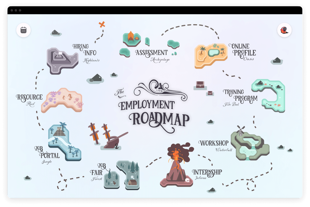
Paying homage to the LGBTQ community with... a pirate map?
At this stage, in collaboration with the lovely folks over at TCW who acted as our liasions, we made the decision to represent jobseeker milestones in the form of a pirate roadmap! We felt that doing so would help facilitate a motivational sense of progression towards a goal, while also giving the platform an engaging and never-before-seen spin. The theme was inspired by Our Flag Means Death, a rom-com about LGBTQ pirates that had just come out (no pun intended).
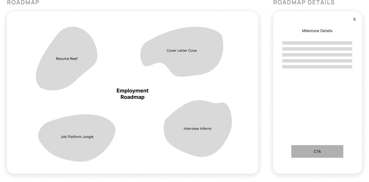
From this point on, I assumed full ownership over this portion of the project. I began by creating a rudimentary sketch, giving each island its own unique, alliterative name for that extra charm factor!
Iterative Wireframing
Putting metaphorical pen to paper.
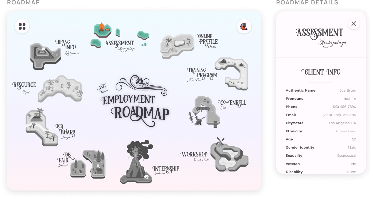
Moving onto mid-fidelity designs, my first order of business was to replace the blobs with actual islands! Each of the 10 islands represents a section of the TCW's old spreadsheet for mangaing jobseekers, but in a reimagined and user-friendly way. Since this would be an external interface, my main goal during this phase was to create a unique visual theme and alliterative name for each island.
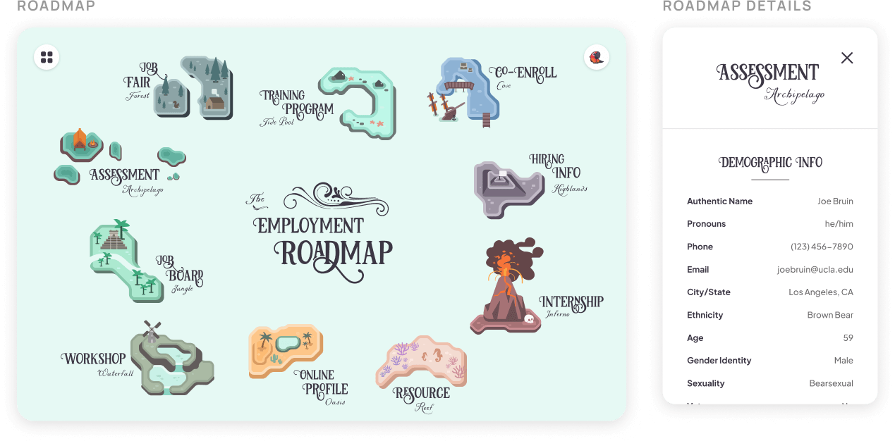
Fast forward several more iterations (although I wish I could show you the whole process!)—the next major update came after showing some preliminary designs to TCW. Per TCW's feedback, I adjusted the roadmap details popup to align more with their brand, and modified the data within them to reflect their new data models. I also continuously built upon the roadmap's visual design to give jobseekers the most fun experience possible!
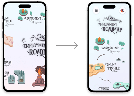
Responsive Design
Accounting for all use cases.
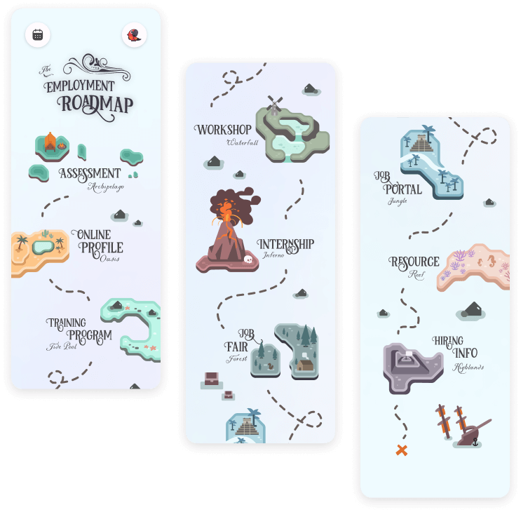
As popularly requested during our user testing, jobseekers can also access their roadmaps from the convenience of their phones! The roadmap responsively condenses into a linear, scrollable design, intentionally crafted to take full advantage of smaller screens while still providing the feeling of navigating a map. This way, we provide a flexible and joyful experience on the go.
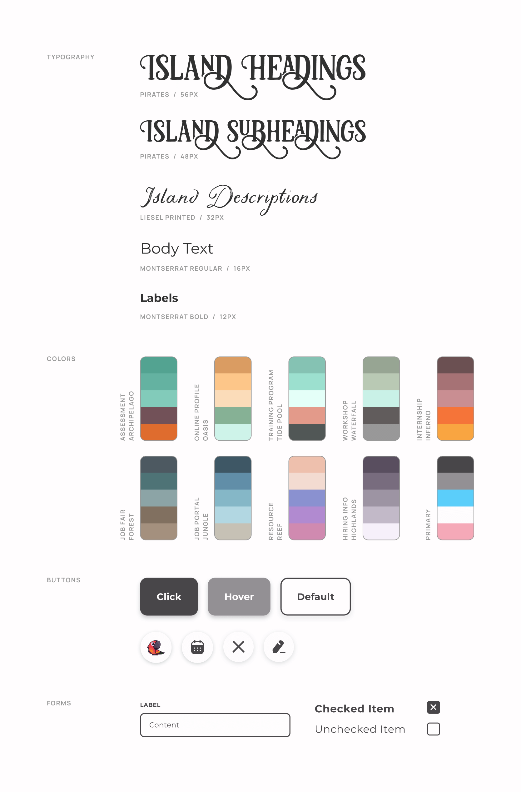
Design System
Balancing stakeholder requests with my own creative additions.
For a project of this scale, it was crucial to create an organized style guide that would ensure consistent design and implementation. Playful fonts and full color palettes were individually chosen for each island to create the most engaging and nautical experience possible. And it's not just for show: by creating and adhering to this style guide, I expedited my design speed in Figma by an estimated 75%!
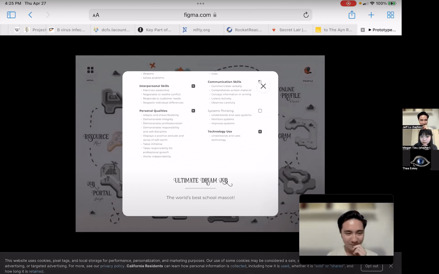
Usability Testing
Translating our design goals into measurable questions.
At this point, the app was ready for testing with some real users. My team and I recruited a mix of jobseekers and navigators, with different levels of experience with TCW, to try out the new roadmap. A session would consist of a series of scenario-based tasks, follow-up questions and feedback, and a questionnaire to help quantify the success of the design.
Feedback Implementation #1
Working with stakeholders to rework and improve upon their initial ideas.
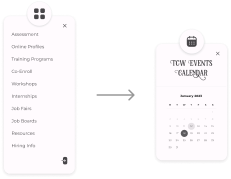
The Menu button on the top-left, which served solely as an alternative way of navigating between islands, was only complicating things without providing any additional accessibility.
Solution
After some discussion, my team and I opted to replace the extraneous menu with a calendar of TCW events, to give convenient access to a common resource and help reduce cognitive load.
Feedback Implementation #2
Eliminating assumptions and meeting users where they're at.
Even in our relatively small testing pool, we saw participants joining the call from tablets and mobile phones. Certain parts of our prototype weren’t equipped to handle these touch interactions, which only emphasized that we couldn’t bank on every user accessing TCW through a computer (an assumption we'd previously made).
Solution
X
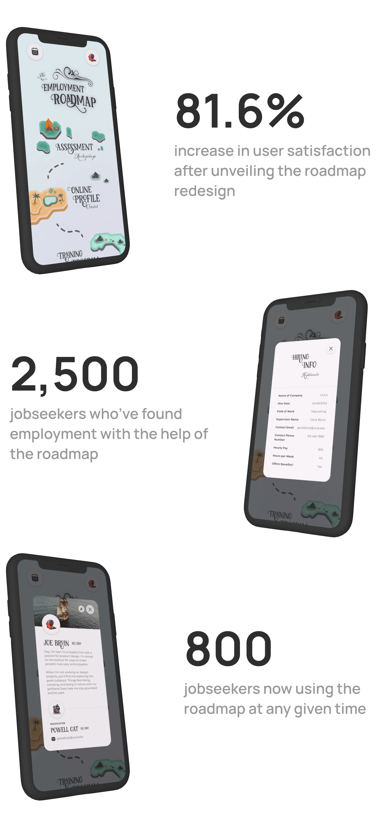
Employment Roadmap
Visualizing the steps to employment and completed progress through a joy-sparking medium.
Roadmap Details
Allowing clients and TCW employees alike to view and manage tasks on their own time.
Profile Page
Providing a means of client-navigator communication and individual expression through a customizable profile.